垂直水平居中
margin:auto && position:absolute
css文档对块级非替换元素在普通流内布局有公式描述Visual formatting model details’margin-left’ + ‘border-left-width’ + ‘padding-left’ + ‘width’ + ‘padding-right’ + ‘border-right-width’ + ‘margin-right’ = width of containing block
当margin-left和margin-right值为auto的时候,则他们的使用值是相同的,并水平居中在包含块(父元素)中,即平分包含块中剩余的水平空间。但是margin-top和margin-bottom为auto的时候,它的使用值是0,所以只使用margin:auto的时候只能实现水平居中而不能实现垂直居中。
If there is exactly one value specified as ‘auto’, its used value follows from the equality.
If ‘width’ is set to ‘auto’, any other ‘auto’ values become ‘0’ and ‘width’ follows from the resulting equality.
If both ‘margin-left’ and ‘margin-right’ are ‘auto’, their used values are equal. This horizontally centers the element with respect to the edges of the containing block.那现在我们再来看看position:absolute;
The box’s position (and possibly size) is specified with the ‘top’, ‘right’, ‘bottom’, and ‘left’ properties. These properties specify offsets with respect to the box’s containing block.
下面是对于top的计算规则,其他三个属性同理
This property specifies how far an absolutely positioned box’s top margin edge is offset below the top edge of the box’s containing block. For relatively positioned boxes, the offset is with respect to the top edges of the box itself (i.e., the box is given a position in the normal flow, then offset from that position according to these properties).
从上面可以看出,top是子元素的margin-top相对于其父元素的padding-top的的偏离距离。所以当设置了position:absolute并同时设置了四个偏移值top:0;left:0;bottom:0;right:0的时候,实际上此时只有top和left值起作用。此时我们再设置了margin:auto,两者就会同时起作用,四个偏移值就会一起配合margin:auto在相应的方向平分剩余空间。
比如,根据上面规则,而此时(若padding和border为0)margin的left和right就会计算为(width of containing block - width)/2。
这样一来,就是可以按需求实现水平居中或垂直居中,或者同时实现水平垂直居中啦~
其中,绝对定位元素具有流体特性,如果该元素没有设置宽高,那么它的将会填充离他最近的定位父元素(如relative,若没有则填充整个浏览器)
具有流体特性绝对定位元素的margin:auto的填充规则和普通流体元素一模一样:
- 如果一侧定值,一侧auto,auto为剩余空间大小;
- 如果两侧均是auto, 则平分剩余空间;
垂直居中
- vertical-align:middle
vertical-align属性只会对inline box有效,所以要想使用vertical-align实现垂直居中,由以下几个方法display:inline
使用该属性可以使元素变为inline element并生成inline box。
注意并不是display:inline-block,详情看另一篇文章[css学习笔记] 可视化格式模型和vertical-align
- line-height
若需要单行文字垂直居中,对块状包含块设置line-height即可,此时line-height撑开了inline box,继而撑开了line box(取其包含的inlinebox最大line-height),继而使包含块有了高度。(可以无需设置height)
但是如果有多种复杂的行内元素,baseline就很容易发生变化,很难取得真正的垂直居中 - 如何实现图片垂直居中?12div { line-height: 300px;}img { vertical-align: middle; height:150px;}
其中div设置的line-height是作用于该div中的line box,则img就可以在这个line box中垂直居中(?)了
但实际上图片并不是绝对居中,还是有一点小偏差的。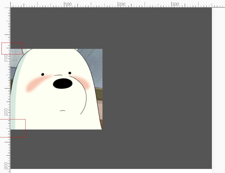
从上图可以看到img是明显下移了。
因为img垂直中心(vertical-align:middle参照的位置)是参照某字符content area的中心,而这个位置是相比于实际绝对居中的位置要往下一点的,即这个参照字符在其所在的匿名行内框中并不是绝对居中的。所以我自己对这个现象有以下的猜测。
我们都知道line-height是两行文字的基线之间的距离。但是除了基线baseline,还有其他标准线:顶线topline、中线middleline、底线bottomline。那现在我们来想象一个情景,浏览器对于文字四条标准都有一个默认的位置。当我们对div设置了line-height的时候,那个参照字符所在的匿名行内框的lineheight也为相应的数值,但是在这个匿名行内框里面,我们无法对这个字符设置vertical-align:middle,也无法对这个匿名行内狂设置line-height而且也无效,因为文档中提到
On a block container element whose content is composed of inline-level elements, ‘line-height’ specifies the minimal height of line boxes within the element.
On a non-replaced inline element, ‘line-height’ specifies the height that is used in the calculation of the line box height.
之前我们在[css学习笔记] 可视化格式模型和vertical-align提到,非置换行内元素都是可以生成inline box,而置换元素通常是img、input等(详情可以看这里)。自然span是妥妥的非置换行内元素,对其设置line-height只会影响到它所在的line box而不是自身的高度。而上面也提到给块状包含块中设置line-height是给它包含的line box设置最小高度,而line box的高度也是影响块状包含块高度的一个要素,所以是直接影响height的。有兴趣可以分别给span和div加background-color和line-height测试一下~
所以这个字符在包裹它的匿名行内框内并不是垂直居中的,或许这也就是为什么文字的中线与实际中绝对居中的位置不同。而img设置vertical-align:middle的时候,它参照的中心点也就不对了。
为此我测试了一下,看下图~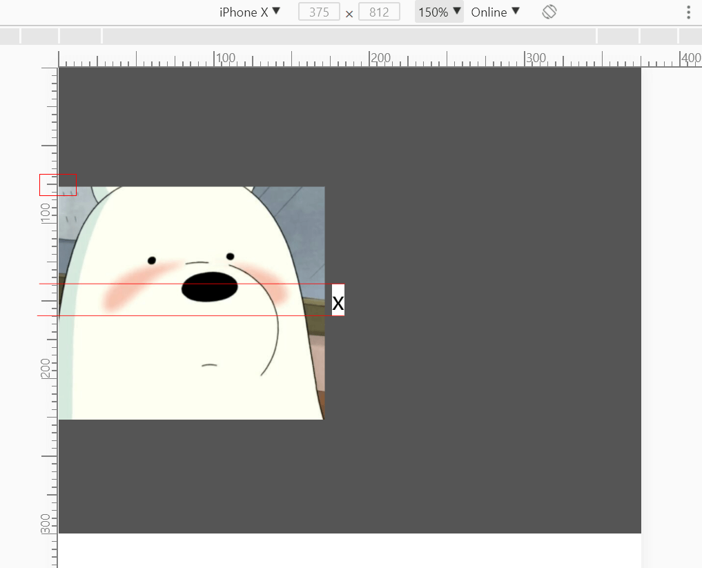
这次我们增加了<span>x</span>并设置了白色的背景颜色,而span因为div设置了line-height的原因也进行了偏移,span实际上只是作为inline box在line box中垂直居中,但文字并没有实现垂直居中。因此img设置了vertical-align:middle之后进行垂直居中的标准是有偏差的。
当然以上居中出现偏差的原因都是我的猜测,如果有不对的请指正~
那要怎么实现完美的垂直居中呢?
让这个参照字符消失:)
噔噔噔~
水平居中
- margin: 0 auto
- text-align:center
- 只对于行内元素有效,方法同上